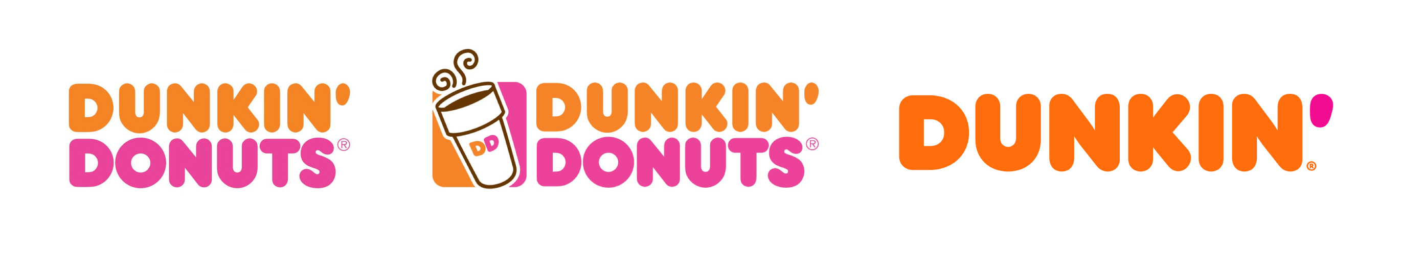
It’s official – Dunkin’ dropped the ‘Donuts’ from their name and simplified their look for a fresh, playful representation of the brand. The new branding will be reflected in advertising, on packaging, in stores and online beginning January 2019.
The distinctive color palette and rounded letters have stuck around since the 70s and the logo remained the same until 2002 when a steaming cup of coffee was added next to the name. This serves as a nice visual cue for the fact that they sell more than just donuts, but I felt the simplicity of the previous logo was better in comparison. Also I’m thinking, ‘hello – how could you not know about their delicious coffee!’ But just last week I was in line at the Dunkin’ Donuts in Midtown and overheard the man in front of me ask an employee if they sold coffee…
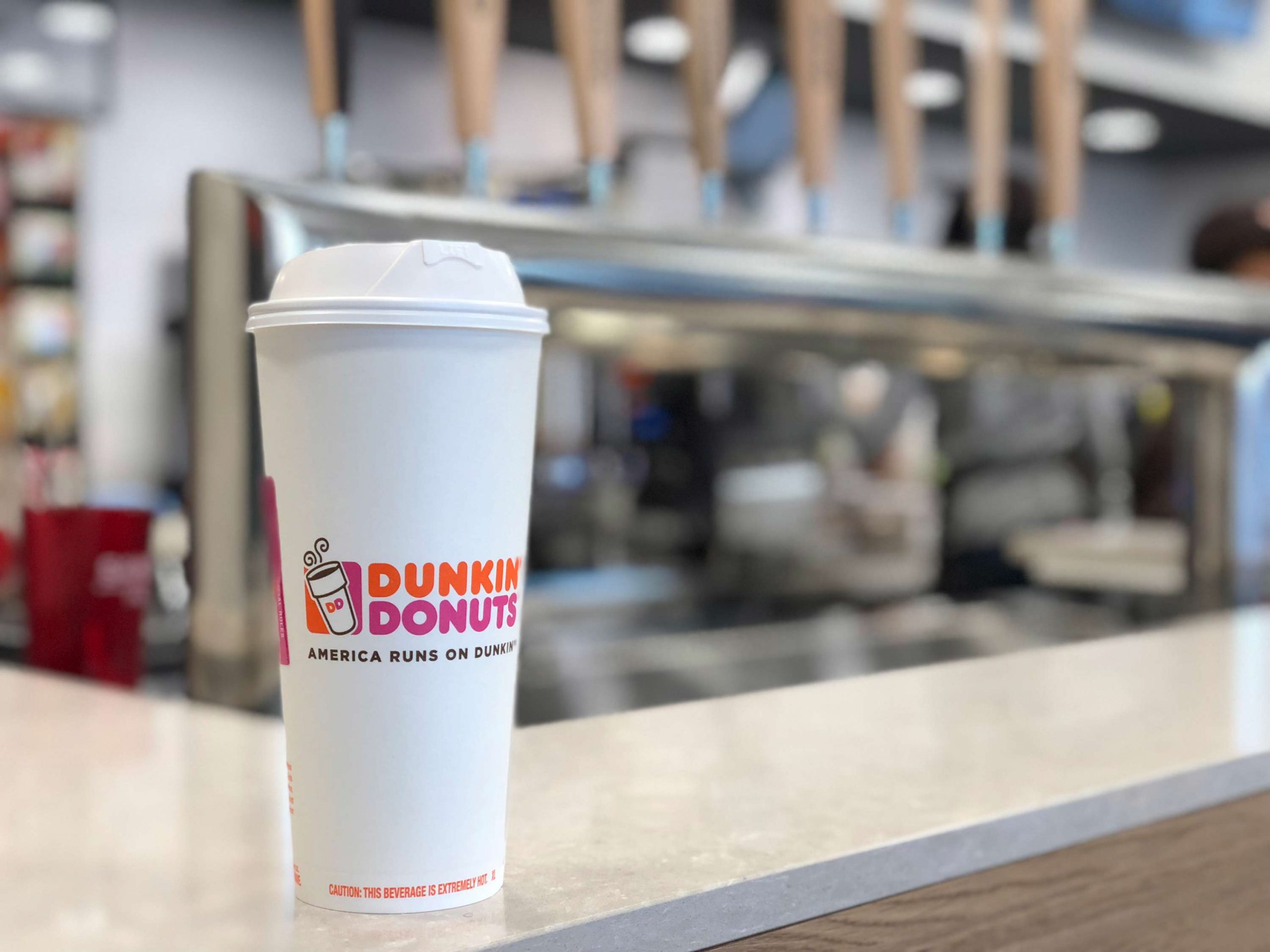
In 2006 they introduced the tagline “America Runs on Dunkin’.” Naturally, this influenced customers to refer to them on a first-name basis. Simply, “Dunkin’.” This feels comforting and nostalgic – but maybe I’m biased, my addiction to their coffee gets stronger each time I pick up an XL hot coffee with eight creams. Every morning. Every day of the week.
With the change in the name and an updated look, Dunkin’ is hoping to boost popularity and emphasize its convenience as “America’s most-loved beverage-led, on-the-go brand.” As a result, the company expects sales to rise about 1 percent this year.
For many companies, a brand reinvention is key for keeping up with constantly evolving markets, environments, and audiences.
Check out some of our own brand reinventions here:
AGDATA
GBI Tile + Stone