 The US power tool brand Black & Decker unveiled a dramatic new look a few days ago, and the opinions among our designers and art directors span an ambivalent spectrum. Some members of our Charlotte marketing agency love the new look, whilst others are unimpressed. This iconic American power tool and hardware manufacturer announced a global rebranding Monday that they they hope results in a simpler, new logo (good-bye ampersand. HELLO plus sign).
Why would anyone buy a Black + Decker power tool? Serious craftsmen seem to prefer Festool and construction guys generally default to DeWalt, but among the sea of color-coordinated tools at Home Depot is there any reason to choose Milwaukee instead of Makita? Bosch over Black + Decker? Branding firm Lippincott hopes to answer that question with a new logo.
Historically, Black + Decker had a strong hold on the power tool market. S. Duncan Black and Alonzo G. Decker started a machine shop in 1910, invented the first pistol grip drill in 1917, and their products were so well respected that they were used by astronauts on NASA’s Mercury and Apollo missions.
However, over the years the brand drifted as the company acquired GE’s consumer products business and started licensing the name to other manufacturers. Gradually, their iconic hexagon logo and heavyweight sans serif font was adorning pink plastic irons, chrome toasters, and dainty Swiffer knock-offs.

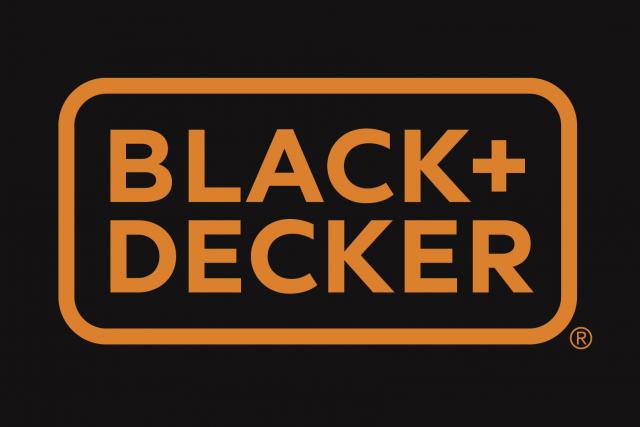
Lippincott, the design and branding firm that worked with Black & – excuse me – Black + Decker on the redesign, says the hardware brand is trying to modernize its imagery by focusing on its products and how they are able to help consumers improve their homes. The new logo also removes the orange hexagon that once accompanied the text.
While the old logo was powerful, robust and exactly the sort of look you’d expect from a company that makes drills and saws, the new design, in my opinion, has a softer, gentler feel – even the rectangle surrounding the brand name has rounded edges.
The immediate reaction to this new look has been mixed. In an industry where brands compete to convince consumers of products strength and durability, it’s oddly unsettling to see such a minimal and meek design and online reviews have so far described it as “weak,” “cheap,” “flimsy,” and “generic.”
But Black + Decker’s new look isn’t a hasty move – the re-design is part of a three year initiative to re-brand Black + Decker and its sister companies DeWalt and Stanley. Stanley’s black and yellow logo has already been given a makeover, and Lippincott designer Marc Hohmann says it’s not just Black + Decker’s identity that has been re-designed but its product range, too.
To tackle this discord and distance Black + Decker from its sister brands, the new identity is trying to be purer, simpler and friendlier. It’s a shame the iconic nut logo has been dropped and the new identity looks a little odd on packaging, but it works well on drills and vacuums (pictured above). And by designing an identity so at odds with other DIY and tool brands, Lippincott has ensured that Black + Decker will stand out on store shelves whether consumers or our charlotte ad agency like it or not.